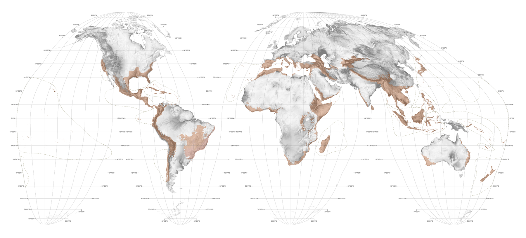


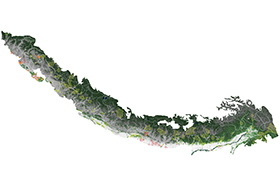
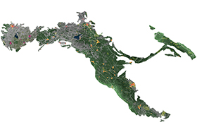
The Hotspot Maps
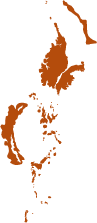
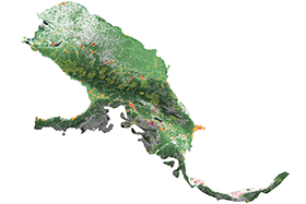
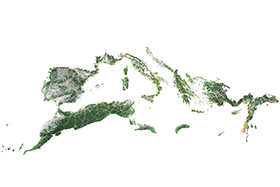
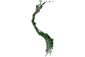
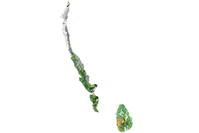
Opening any of the hotspots hyperlinked in the map above or in the menu below leads to three sets of maps. First, a (black) map of the hotspot itself showing how much protected area (IUCN categories I-VI, plus NA lands) is currently in that hotspot; second, maps of each of the ecoregions within the hotspot showing how much protected area (IUCN categories I-VI, plus NA lands) exists at this finer grain; and finally, 'conflict maps' which zoom into each major city in the hotspot showing how these cities are growing in relation to remnant habitat and endangered species.1
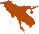
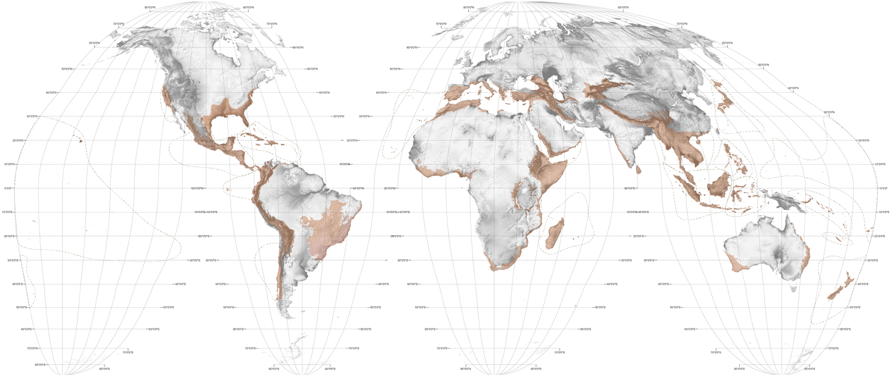
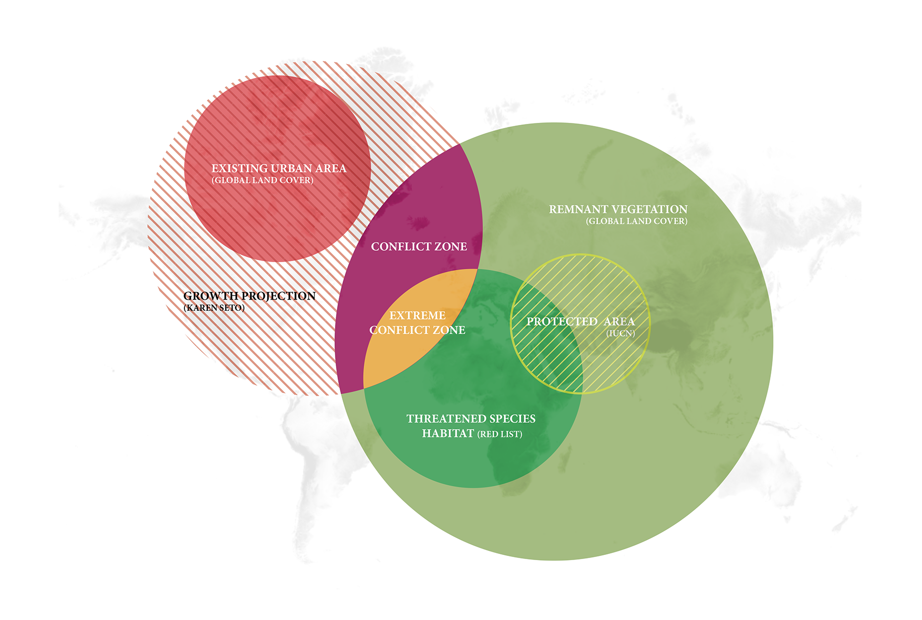
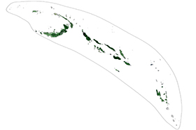
The hotspot maps show protected areas (as of 2015) broken into three broad groups based on their primary management objectives as classified by the IUCN: categories I-IV; categories V-VI; and NA. The categories range from strictly protected nature reserves, wildlands and parks (I-IV) to areas of more lenient management with the potential for development and the sustainable use of natural resources (V-VI). Representing roughly 35% of the number of global protected areas tabulated, the NA category does not denote lax management policy, simply areas that for one reason or another have not adapted the IUCN management classification system.2
The following methodology was utilized in calculating total protected areas and biodiversity target shortfalls. GIS shapefiles for protected areas3 and hotspots4 were downloaded from publicly accessible databases. Individual hotspots were isolated and separate datasets were created by partitioning protected areas into the three groups described above. Each new dataset was clipped to the boundary of the isolated hotspot, flattened to eliminate any overlapping areas, and then total protected area was calculated. Hotspot areas were calculated in the same projection, and a square equivalent to 17% of the hotspot's total area is drawn to scale beside the hotspot map. The three protected area groups are visually compared against the 17% target square. The resulting maps expose 21 hotspots short on protected areas and 14 that have reached global targets. The outlook, however, is more complex when further analyzed to account for the representative distribution of protected areas across each hotspot's constituent ecoregions.
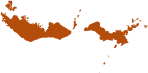
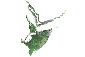
The Ecoregion Maps
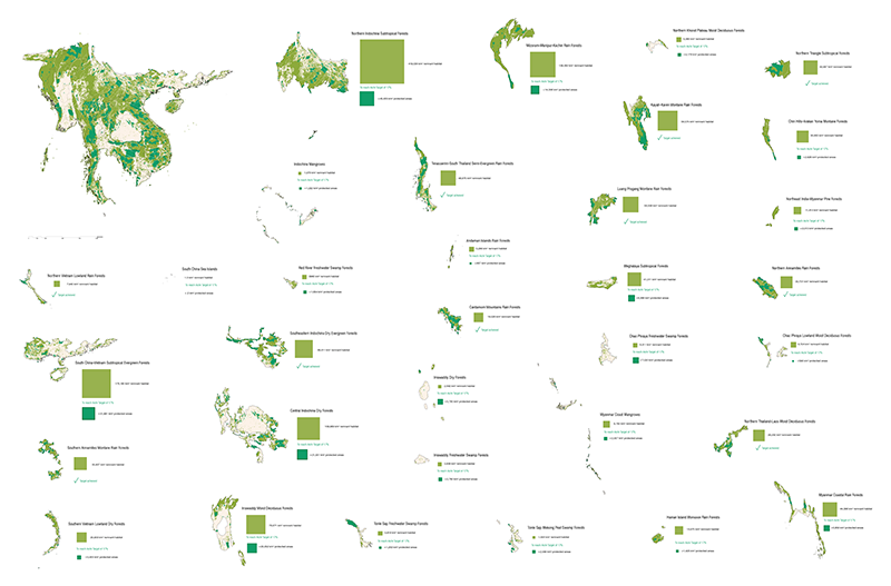
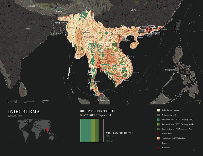
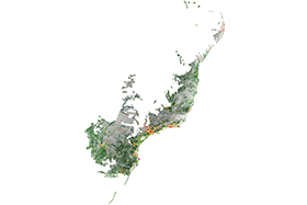
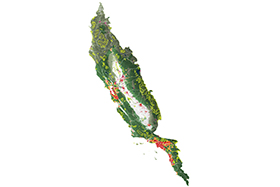
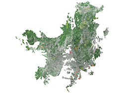
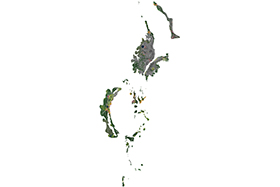
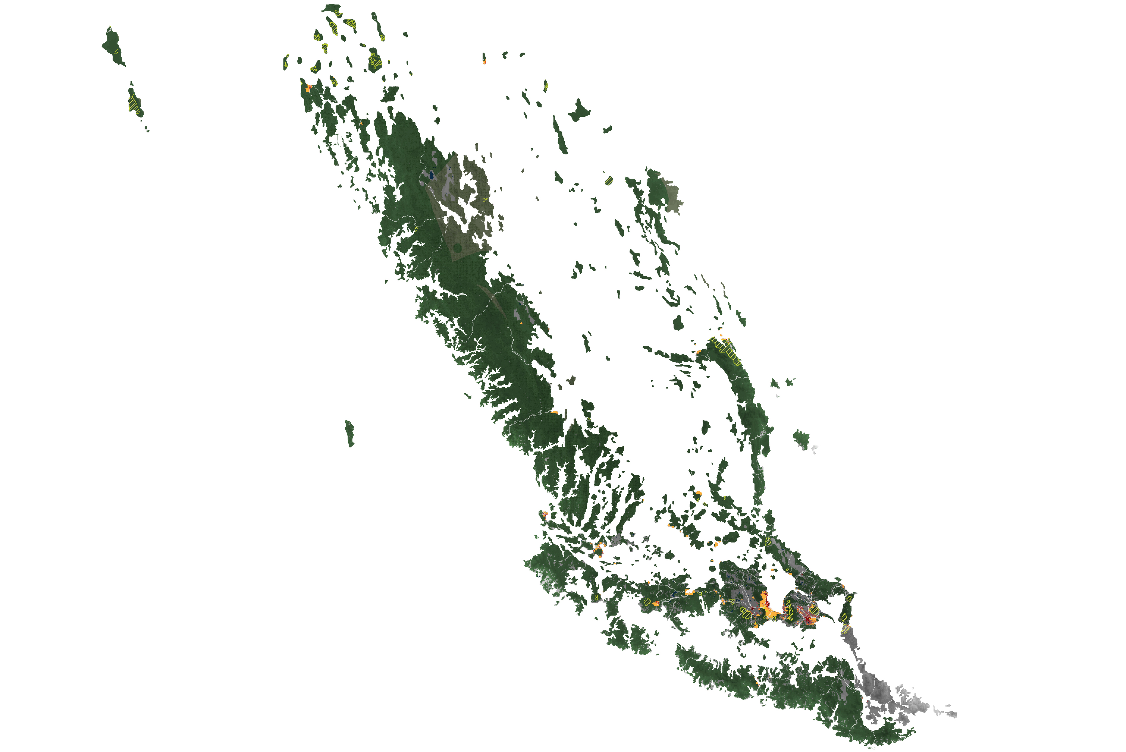
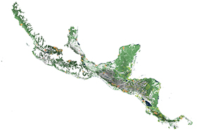
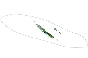
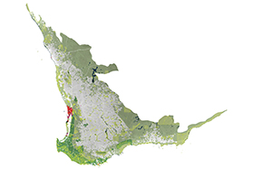
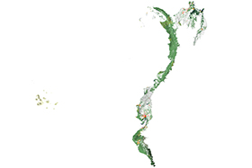
As illustrated above with the example of the Indo-Burma hotspot, in this Atlas each of the world's hotspots are broken down into their constituent ecoregions so as to audit the protected area at that finer scale. Any one hotspot is composed of a number of ecoregions that may range from coastal mangroves to alpine shrub and grasslands. These ecoregions are regionally specific to geophysical and climatic forces — varying across changes in elevation, geology and rainfall. Their designation, however, is somewhat puritanical and antiquated — immune to political borders and changing land-uses. The elimination of these numerous cultural variables, while not practical for actionable conservation purposes, is helpful in distilling a vast array of vulnerable lands that most urgently require protection and restoration to meet the biological needs of a variety of species and ecological communities that have already undergone disruption and fragmentation.
On our ecoregion maps which follow each of the hotspot maps, in comparison to the amount of existing protected area in each ecoregion, we highlight the amount of land that is neither protected nor evidently subject to intensive agricultural crop production. These extensive (light green) areas are lands that Erle Ellis refers to as "the remnant, recovering, and managed novel ecosystems formed by land use and its legacies … the predominant form of terrestrial ecosystems today and into the future."5 It is in these weedy, feral territories, much of it probably used as grazing rangelands which have both low biodiversity and low agricultural value that the fate of much of the world's biodiversity will ultimately be decided. These are the degraded lands into which biodiversity is being forced and across which connectivity must be established if the adaptation of species to climate change is going to be facilitated. These are also lands likely to face increasing pressure from the world's ever expanding agricultural frontier.
Determination of what we refer to as remnant habitat began with a rasterized depiction of land-cover classification on a high-resolution image of the world.6 The raster was converted into a shapefile (vector), and specific layers removed (agriculture, barren, water/ice, urban). Depending on the degree to which these remaining lands are grazed they are theoretically viable terrestrial habitat, or at least areas that can be restored to create viable habitat without significant destruction to developed areas or crop systems. Importantly, we modified the remnant habitat delineation derived from our GIS analysis by first subtracting any overlapping protected areas. This ensured that only non-protected viable lands are included in our analysis. The remnant habitat was then clipped by the ecoregion outlines, and compressed in order to calculate its area. These values are re-drawn as squares at the same scale as the original map in order to demonstrate the additional land area within a given ecoregion that must be protected to meet the target (teal-green), and how much viable habitat remains in which to do so (light green).
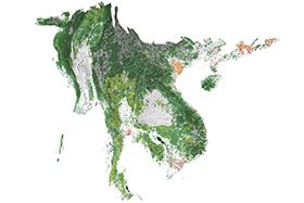
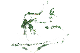
Conflict Maps
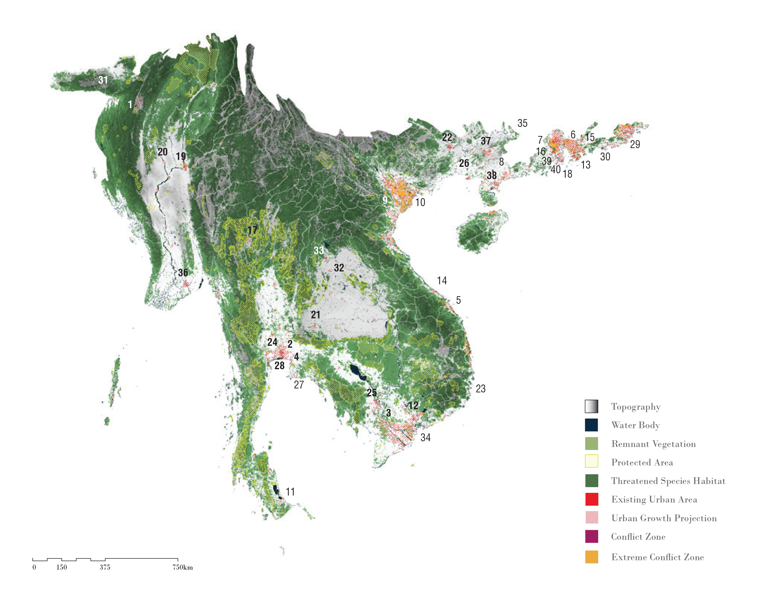
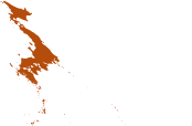
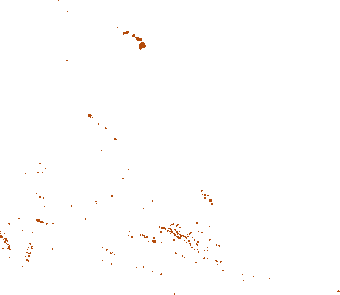
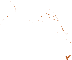
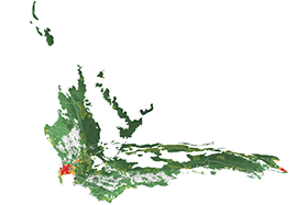
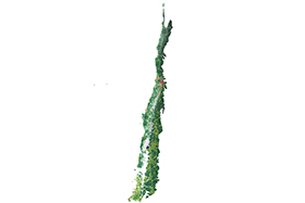
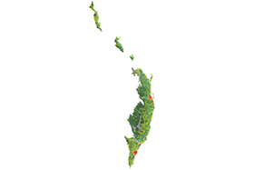
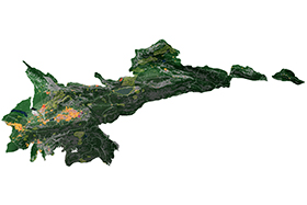
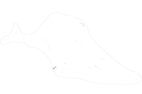
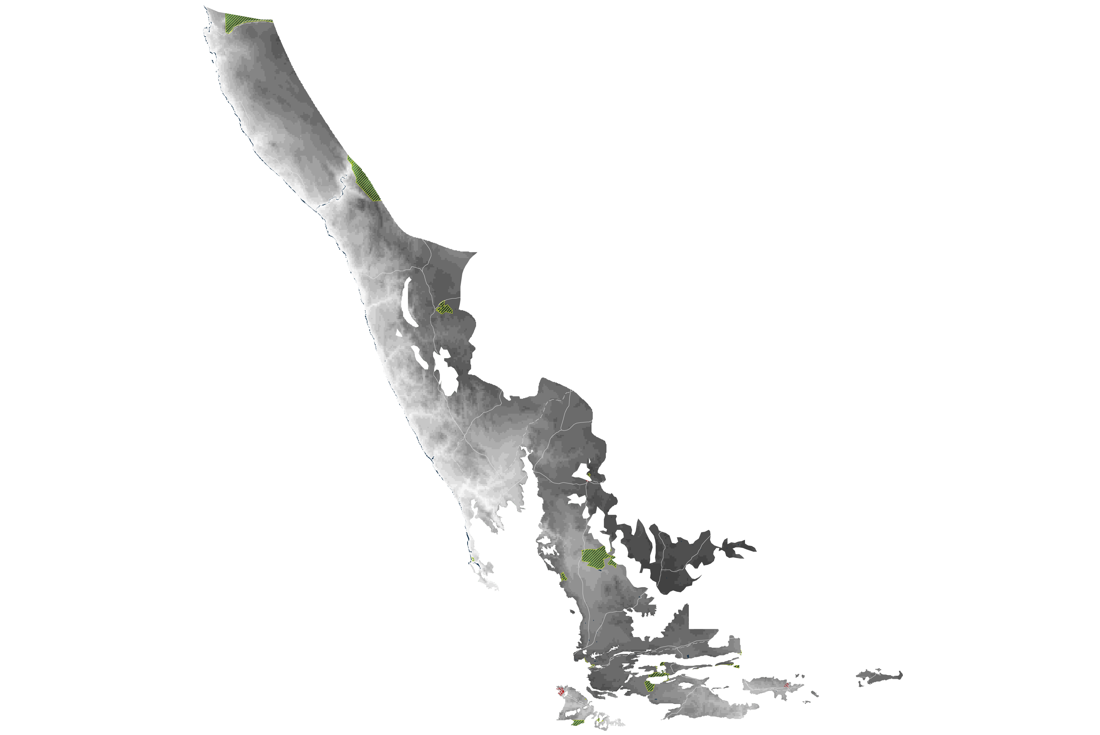
The map above is an example of a 'conflict map'. There is a conflict map for each of the world's hotspots. Whereas the hotspot maps and the ecoregion maps show protected areas and remnant habitat, the conflict maps identify areas (colored orange) where urban growth and remnant habitat (biodiversity) are on a collision course. The conflict maps show this at the scale of each hotspot but appended to the conflict maps is also a series of smaller circular maps which focus on each of the cities in the hotspot. Our choice of cities was determined by United Nations' urban population data, which defines cities as urban areas with 300,000 inhabitants or more.7 According to our analysis, 383 of the 423 cities in the world's biological hotspots are sprawling and can be expected to continue to sprawl directly into remnant habitat.
These cities tend to be the major urban growth centers in the hotspots, but this is not to suggest that conflict is only occurring in these areas of urban sprawl. The conflict maps and the zoomed-in city maps are very coarse and should be taken as only a cursory analysis conducted within the feasibility of this initial study. Although the Convention on Biological Diversity encourages what it refers to as 'biodiversity friendly city design' and 'holistic landscape management practices' at the sub-national scale, insofar as we can tell there is a marked lack of design and planning intelligence being applied at a whole-of-city scale to the relationship between biodiversity and urban growth in most of the 423 major cities in the hotspots.8
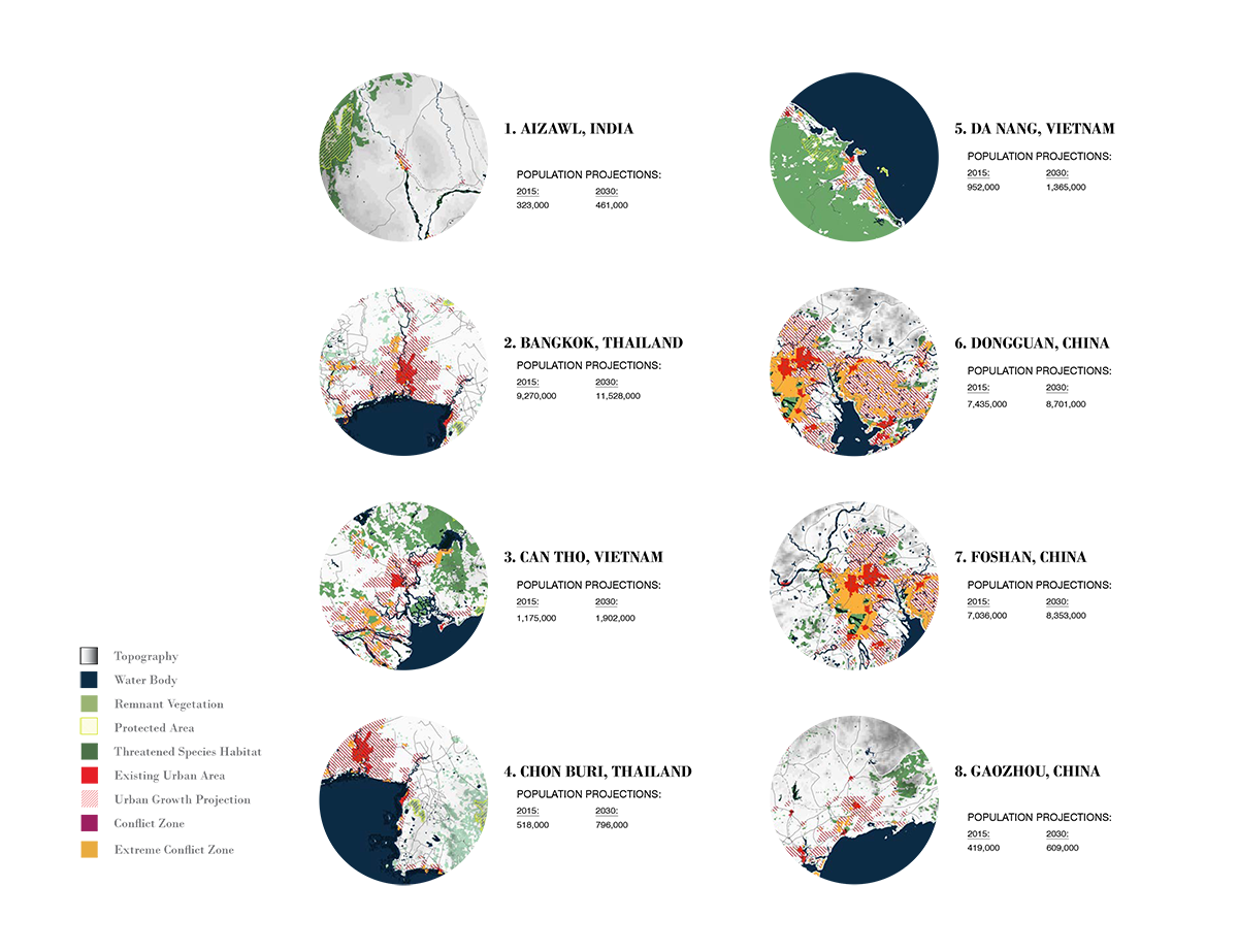
The way we have mapped each of these cities is to overlay their (2030) projected growth trajectories with existing landscape conditions to identity zones of immanent conflict between their growth and extant habitat. The growth area data projected out to 2030 for each city is sourced from the Seto Lab at Yale.9 Each grid possesses a possibility of urbanization (as explained in footnote 9). We have extracted those that have a possibility of 50% or higher (areas more likely than not to become urbanized) as the growth projection zone. These urban growth projections are then overlaid on top of the remnant vegetation data from the Global Land Cover Facility10 and IUCN Red List11 of ranges for 3,245 mammal species that are either critically endangered or endangered. Due to technical and time constraints, the research only used mammal species as a start to examine the potential conflicts that lie between immanent urban development and biodiversity. These maps draw attention to places in need of urban design strategies to mitigate such flashpoints.
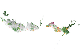
Following this, in the section titled Hotspot Cities we zoom in on each of the biggest and fastest growing cities in each of the hotspots to show more precisely where urban growth and endangered species are in conflict.
Atlantic Forest
California Floristic Province
Cape Floristic Region
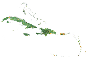
Caribbean Islands
Caucasus
Cerrado
Chilean Winter Rainfall Valdivian Forests
Coastal Forests of Eastern Africa
East Melanesian Islands
Eastern Afromontane
Forests of Eastern Australia
Guinean Forests of West Africa
Himalaya
Horn of Africa
Indo-Burma
Irano-Anatolian
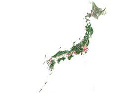
Japan
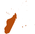
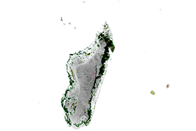
Madagascar & The Indian Ocean Islands
Madrean Pine-Oak Woodlands
Maputaland Pondoland Albany
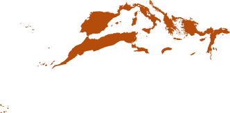
Mediterranean Basin
Mesoamerica
Mountains of Central Asia
Mountains of Southwest China
New Caledonia
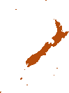
New Zealand
North American Coastal Plain
Philippines
Polynesia-Micronesia
Southwest Australia
Succulent Karoo
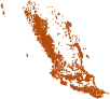
Sundaland
Tropical Andes
Tumbes-Choco-Magdalena
Wallacea
Western Ghats & Sri Lanka
1 Mapping in general and atlases in particular pride themselves on accuracy and whilst we have stayed true to our sources, in the case of ever-changing environmental phenomena, maps are only as good as their most recent update. The protected area mapping upon which the hotspot maps and the ecoregion maps are based is z data from the World Database on Protected Areas (WDPA). The WDPA is a joint project of the IUCN and UNEP. It is considered the only database of protected areas globally.
Protected areas have increased globally by roughly 2% since 2013 when we began this research, but only a small proportion of that increase is in the hotspots. In broad terms, the relationship shown between CBD protected area targets and what is actually on the ground in both the hotspot maps and the ecoregion maps will remain valid, albeit at a coarse grain of resolution, for some years to come.
2 Approximately 9% of the total number of protected areas globally have been occluded from the mapping because the sites lack key spatial information. The WDPA recommends using this data for more accurate representation of total area protected however many of the sites have no area reported and many overlap with the more accurately spatialized sites.
3 IUCN & UNEP-WCMC, The World Database on Protected Areas (WDPA) (Cambridge: UNEP-WCMC, 2015). Available at www.protectedplanet.net.
4 Critical Ecosystem Partnership Fund, "The Biodiversity Hotspots," http://www.cepf.net/resources/hotspots/Pages/default.aspx (accessed June 1st, 2016).
5 Ellis, "Anthropogenic Taxonomies," 179.
6 Sourced from the Institute of Environment and Sustainability at the Joint Research Centre of the European Commission, 2014. https://ec.europa.eu/jrc/en/about/institutes-and-directorates/jrc-ies
7 United Nations, World Urbanization Prospects: The 2014 Revision (United Nations: 2014). Available at https://esa.un.org/unpd/wup/Publications/Files/WUP2014-Highlights.pdf (accessed June 1, 2016).
8 Convention on Biological Diversity, "COP 10 Decision X/22," https://www.cbd.int/decision/cop/default.shtml?id=12288 (accessed June 1st, 2016).
9 Karen C. Seto, Burak Güneralp, & Lucy R. Hutyra, "Global Forecasts of Urban Expansion to 2030 and Direct Impacts on Biodiversity and Carbon Pools," Proceedings of the National Academy of Science of the United States 109, no. 40 (2012): 16083-16088.
Karen Seto and her team explain, "[t]he forecasts are developed in two phases. In the first phase, for each region we generate 1,000 estimates of aggregate amount of urban expansion by randomly drawing 1,000 values each from the corresponding probability density functions (PDFs) of projected GDP and urban population. We use the uncertainty ranges in population and GDP projections to estimate the corresponding PDFs. In the second phase, we use the aggregate amounts and simulate their spatial distribution using a spatially explicit grid-based land change model (44), which uses slope, distance to roads, population density, and land cover as the primary drivers of land change. Our analysis assumes no new road development. Significant changes in road development would change the spatial patterns but not the amount of new urban expansion."
10 Sourced from the Institute of Environment and Sustainability at the Joint Research Centre of the European Commission, 2014. https://ec.europa.eu/jrc/en/about/institutes-and-directorates/jrc-ies (accessed May 1st, 2015)
11 The IUCN Red List of Threatened Species, http://www.iucnredlist.org (accessed June 1, 2016).